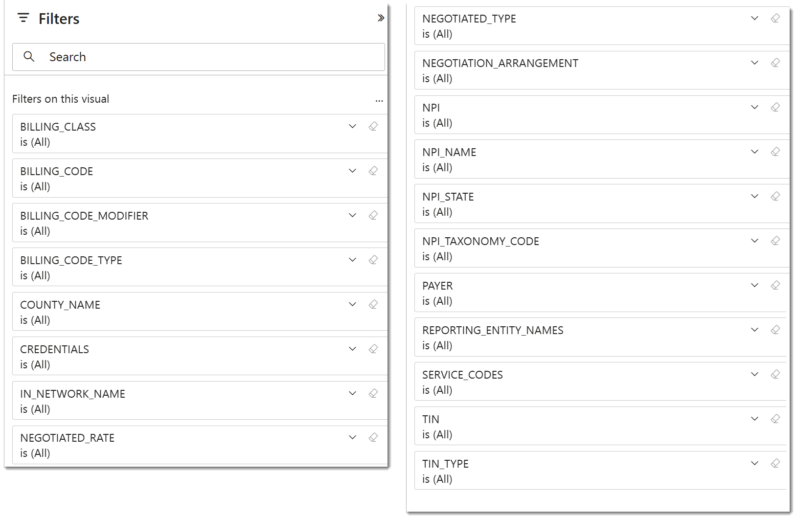
Overview
PowerBI Feed for Payer Rates is an online database that Trella Health has compiled from publicly available data but organized for you in an easily understandable format. This article will show the value of the PowerBI Feed for Payer Rates, along with a walkthrough of the different features and reports. Most importantly, there are five reports that provide different, detailed views of payers, providers, and rates tied to specific HCPCS codes.
![]() The amount of data we have compiled is enormous. It will probably be helpful if you know which payers and providers you want to evaluate and which HCPPCS code you want to evaluate.
The amount of data we have compiled is enormous. It will probably be helpful if you know which payers and providers you want to evaluate and which HCPPCS code you want to evaluate.
 In this article
You can read through the entire article to dig in on all of the details of the page, or, you can choose a report of interest and navigate directly to the report specific section of this article using the links below.
- The Power behind PowerBI - basic info to set the stage - data summary, features, use cases, and definitions.
- Dashboard overview - and the features common to each report's page
- Report pages
- Average Rates by Payer - different rates for different payers
- HCPCS Price Range by Payer - detailed rates for a single payer
- Rates by Reporting Entity - detailed rates for an org by reporting entity
- Organization & Payer – Rate Comparison - A complete list of rates for all providers and payers
- Organization Profile - Any easy way to see all rates for multiple HCPCS codes for a single organization
 The Power behind PowerBI
Data
The metrics shown in the PowerBI dashboard are analyzed from a huge data set that includes:
- Pricing from all major commercial insurers (170M lives, 95% of commercial coverage)
- 10,000+ insurance plans across all 50 states
- 3.5 million healthcare providers and organizations
- 47,625 CPT codes, 76,315 HCPCS codes, 893 MS-DRG codes
![]() Yeah, all that! And using the tools, you can slice and massage the metrics to squeeze out the insights you want.
Yeah, all that! And using the tools, you can slice and massage the metrics to squeeze out the insights you want.
Feature overview
Before we show you all the details, here is a short summary of what is available.
- Pre-built reports designed for customers with minimal or no BI experience
- Enhances accessibility, visualization, and decision-making
- Quickly interpret the complex payer rates data with interactive visuals and charts
- Filtering and drill-down capabilities allow for deeper analysis based on specific needs
- Increased efficiency with automated data updates reduce manual reporting, freeing up resources for higher-value activities
Use Cases
To prime the pump of your thinking, here are some ways to use PowerBI!
- Negotiate better rates with commercial payers
- Compare rates by code for a given payer across all providers – see where you rank
-
Identify new payers to partner with best on favorable rates
- Analyze which payers have the best reimbursement for given codes
-
Identify additional products/infusion therapies that you should be selling based on current payer rates
- Identify which adjacent products have strong rates from a payer you are already contracted with.
-
Expand into new markets
- Identify which markets have favorable rates by analyzing commercial payers.
-
Identify acquisition opportunities
- Identify organizations with better rates to improve your overall rates with a given payer
- Identify organizations with lower rates and transition to your contracts for an immediate revenue increase
-
Revenue cycle integrity
- Compare payer Explanation of Benefits (EOBs) to price transparency fee schedules
-
For J-Codes, the data tells us:
- Payer Benchmarking: How do payers compare to each other's reimbursement rates? •Competitor Benchmarking: How do provider reimbursements compare to each other?
 Important definitions
For negotiated type there are five allowable values: "negotiated", "derived", "fee schedule", "percentage", and "per diem". The values are defined as:
- Negotiated: If applicable, the negotiated rate, reflected as a dollar amount, for each covered item or service under the plan or coverage that the plan or issuer has contractually agreed to pay an in-network provider, except for prescription drugs that are subject to a fee-for-service reimbursement arrangement, which must be reported in the prescription drug machine-readable file. If the negotiated rate is subject to change based upon participant, beneficiary, or enrollee-specific characteristics, these dollar amounts should be reflected as the base negotiated rate applicable to the item or service prior to adjustments for participant, beneficiary, or enrollee-specific characteristics
- Derived: If applicable, the price that a plan or issuer assigns to an item or service for the purpose of internal accounting, reconciliation with providers or submitting data in accordance with the requirements of 45 CFR 153.710(c)
- Fee schedule: If applicable, the rate for a covered item or service from a particular in-network provider, or providers that a group health plan or health insurance issuer uses to determine a participant’s, beneficiary’s, or enrollee’s cost-sharing liability for the item or service, when that rate is different from the negotiated rate
- Percentage: If applicable, the negotiated percentage value for a covered item or service from a particular in-network provider for a percentage of billed charges arrangement. Note: percentage values entered into the negotiated_rate attribute are to be a whole number percentage of the negotiated arrangement (i.e. 40.5% should be entered as 40.5 and not .405)
- Per diem: If applicable, the per diem daily rate, reflected as a dollar amount, for each covered item or service under the plan or coverage that the plan or issuer has contractually agreed to pay an in-network provider
![]() For more information, see details in the CMS Price Transparency Guide.
For more information, see details in the CMS Price Transparency Guide.
Dashboard Overview
PowerBI for Payer Rates has five reports that are each described in their own sections, below. Some elements of the PowerBI dashboard are universal to every report page. Use the following image to familiarize yourself with the layout and features.
![]() Many of the features on the PowerBI site are outside the scope of this article. We will skip some features, summarize others, and point out necessary or useful ones.
Many of the features on the PowerBI site are outside the scope of this article. We will skip some features, summarize others, and point out necessary or useful ones.
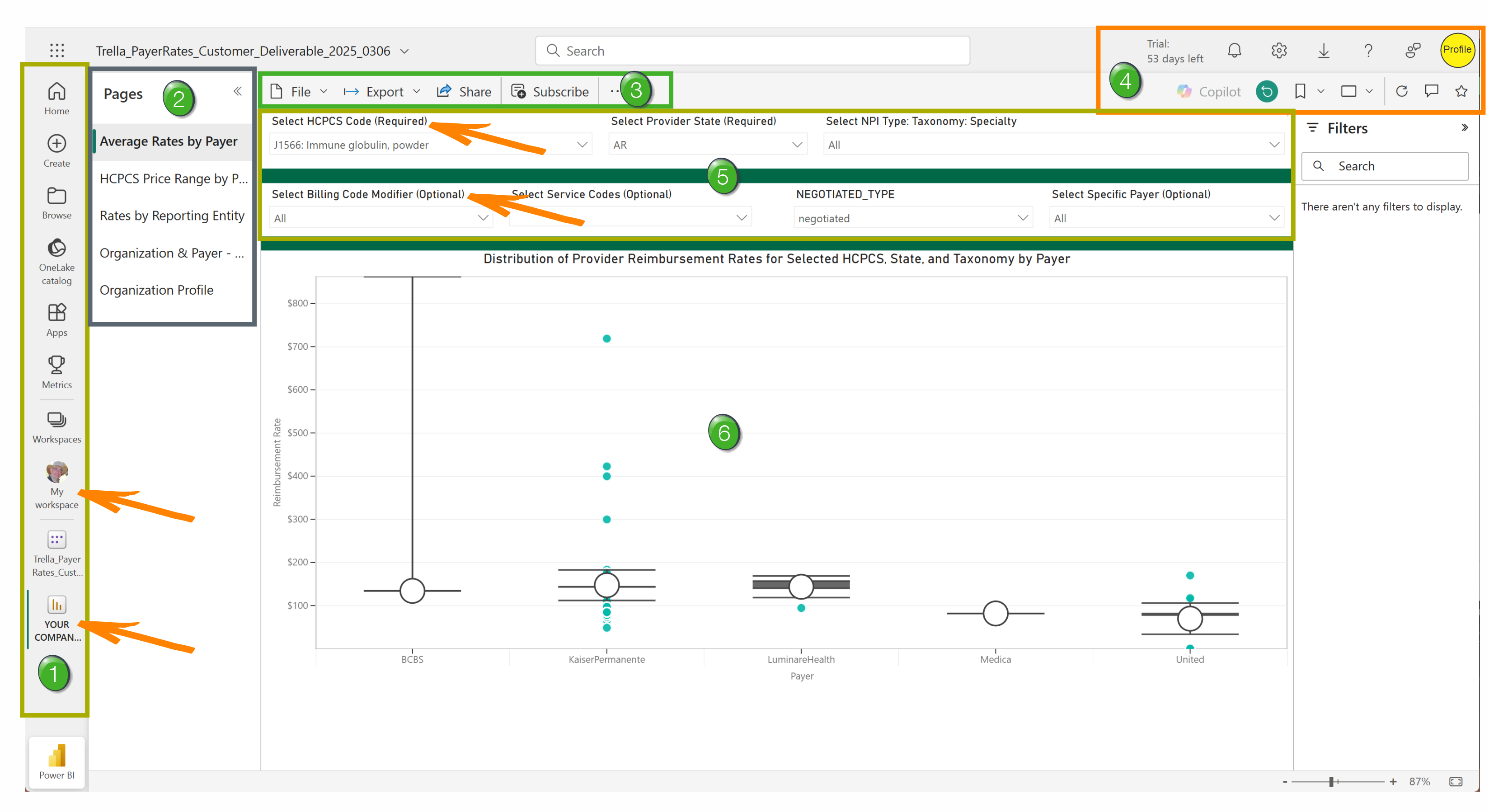
![]() Left Menu - The options in the menu on the left are not Trella Health tools and are not supported by Trella Health.
Left Menu - The options in the menu on the left are not Trella Health tools and are not supported by Trella Health.
However, the two buttons indicated by the arrows are useful.
- My Workspace - Clicking on this button will open a page where you can choose between any reports you have access to.
- Your Company Name - Clicking this button should open the reports your company has access to.
Most of the time, when you open PowerBI, you should be taken directly to the reports your company subscribes to.
![]() Report Navigation - there are five pages listed on the left side. Each is a button that you can click to open the report listed.
Report Navigation - there are five pages listed on the left side. Each is a button that you can click to open the report listed.
![]() Menu - There are a number of menu items near the top left of the page. (See image.)
Menu - There are a number of menu items near the top left of the page. (See image.)
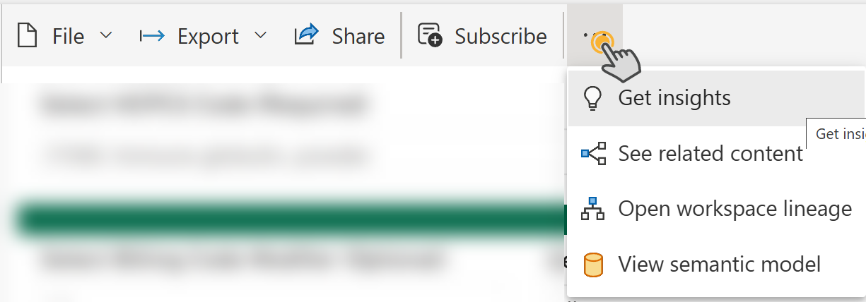
![]() These options are not a Trella Health tool and are not supported by Trella Health. However, we do provide the following guidance.
These options are not a Trella Health tool and are not supported by Trella Health. However, we do provide the following guidance.
- File - We have tested the options under "File" and they do not work.
- Export - You are able to export the chart on the page directly to your Powerpoint to add it to a presentation. This feature is excellent. You will need a Powerpoint license.
- Share - by adding an email address, you can send a link to a colleague so they can see the report with your settings. They must have access to PowerBI to view the page you share.
- Subscribe - set up a subscription for the report on the page.
- Additional options - the additional options that open when you click on the three dots are advanced functions that are not set up to work on these pages.
|
|
|
| Notifications - Any alerts or updates that come in for you. | |
| Settings - global settings for the site. |  |
| Downloads - Numerous download options. |
|
| Help and Support - If you want to dig in on any of the other tools, you will be able to learn how to use them here. | |
| Help Improve Fabric - submit suggestions or ideas. | |
| Profile - basic settings for your account. |  |
| Copilot - MS Copilot - application must be active on your computer to use. |  |
| Reset - resets optional settings for the report on the page to the default settings. |  |
|
Bookmark - Captures the current settings for the report on the page.
|
 |
| Sizing - allows you to choose how the chart on the page is displayed. | |
| Refresh - updates the chart on the page with the latest data. | |
| Comment - Add a comment to the report for other users to view. | |
| Favorite - make the open report a favorite. | |

![]() Filters - allow you to change the parameters for the chart or table shown in the report. What you choose will determine what shows up in the table or chart included in the report.
Filters - allow you to change the parameters for the chart or table shown in the report. What you choose will determine what shows up in the table or chart included in the report.
- The filters will vary depending on the report selected
- Some filters are required, others are optional - this will also change, depending on the report. In an odd twist, filters are identified as (Required) and (Optional). Other times, this is not indicated, and those filters are sometimes required, and sometimes optional. Check each filter to make sure it is showing what you want.
- Some filters will not provide any options, depending on the selected report. In some cases, depending on another filter you have set, some additional filters may not include any options, or only a single option.
- When a filter only has one option the report will default to that option.
![]() Filters will be described for each report.
Filters will be described for each report.
![]() Report - The selected report will show up in the main section of the page.
Report - The selected report will show up in the main section of the page.
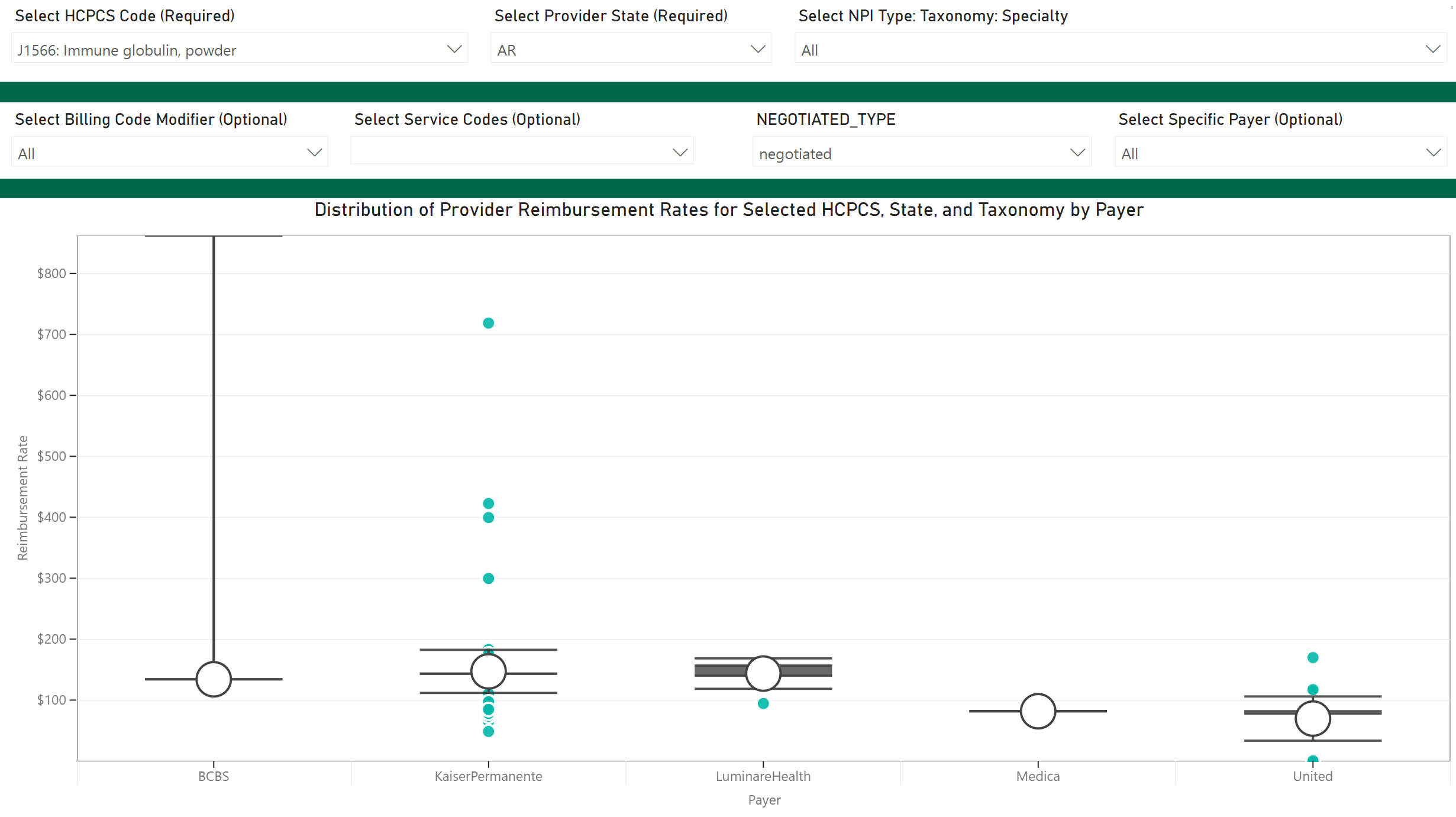
Average Rates by Payer (Chart)
Which payers engage in rate negotiations? How much are those payers paying? What is the spread of those payment amounts? This chart is going to answer those questions!
![]() The chart on this page is about rates. What we will see is different rates for different payers, and which providers were reimbursed at the rates shown.
The chart on this page is about rates. What we will see is different rates for different payers, and which providers were reimbursed at the rates shown.
Filters
Here are the filters for the Average Rates by Payer report
Filter name |
image |
|
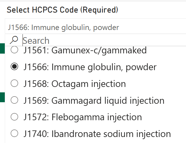
Select HCPCS Code (Required) - You must choose a single option from the list For our example we chose J1566: Immune globulin, powder |
 |
|
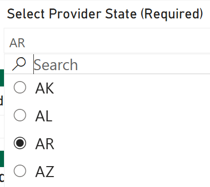
Select Provider State (Required) - You must choose a single state For our example we chose Arkansas (AR) |
 |
|
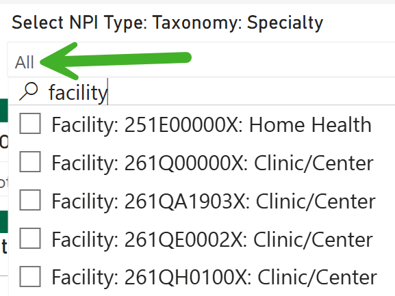
Select NPI Type: Taxonomy Specialty (Optional) - Select a specific provider type to filter the chart to that specific provider type For our example, we chose to see data for all providers |
 |
|
Select Billing Code Modifier - (Optional) - Choosing a billing code modifier will limit the results in the chart to transactions using the modifier In our example, there were no modifiers to display. |
No image to display |
|
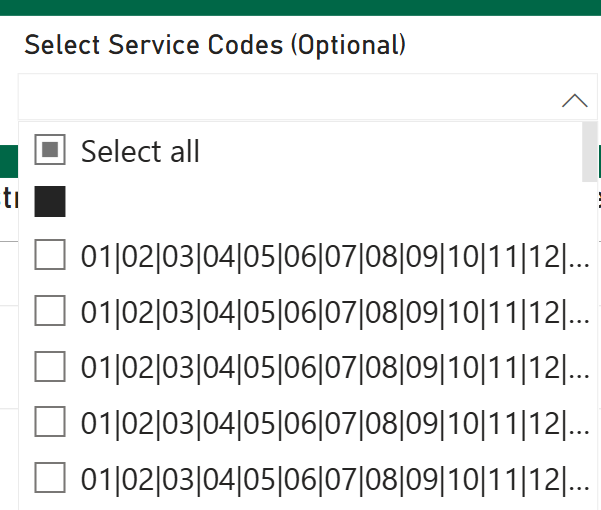
Select Service Codes - (Optional) - You can select some codes and groups of codes, which are presented as two digits. For our example table, we chose the "Select all" option.
|
 |
|
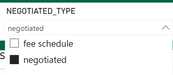
Negotiated Type - (This filter is required, even though it is not marked as such) For our example we chose the "negotiated" type.
|
 |
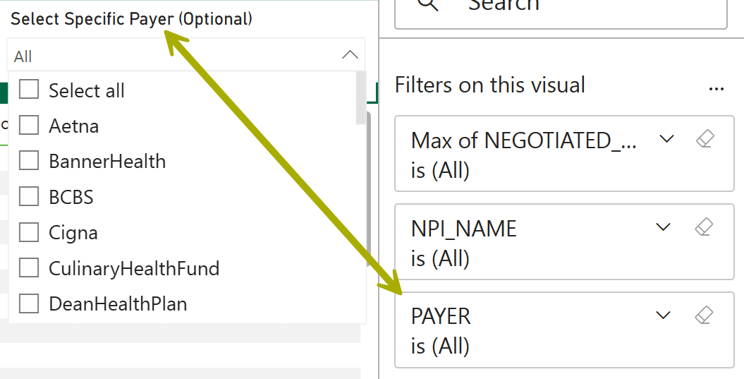
| Select Specific Payer - (Optional) - If you want to only view a single payer in the chart, use this filter to select a single payer. | 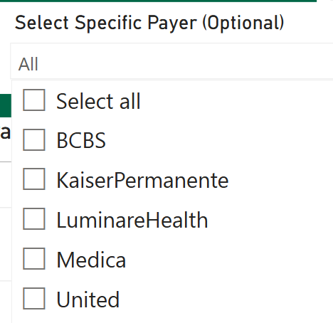 |
Chart Details
Once you have set the filters, the chart will display the results:
![]() Quick Observations
Quick Observations
- The X-Axis of the chart shows the payers that match the filter criteria
- The Y-Axis is US dollars
![]() Value
Value
- Compare different payers side-by-side for the selected HCPCS code
- Identify the spread of negotiated prices for a specific payer, along with the recipients of each negotiated price
Let's take a look at our example, negotiated prices for Kaiser Permanente for J1566 - Immune globulin in Arkansas
| Details | Image |
|
|
|
| Mean - hover over the big empty circle to reveal the mean average. | 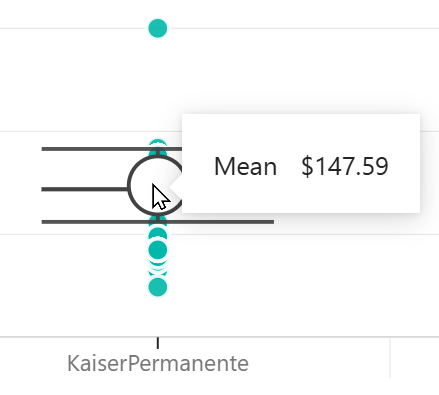 |
| Data point details - hover over an individual gray circle for a specific price breakdown | 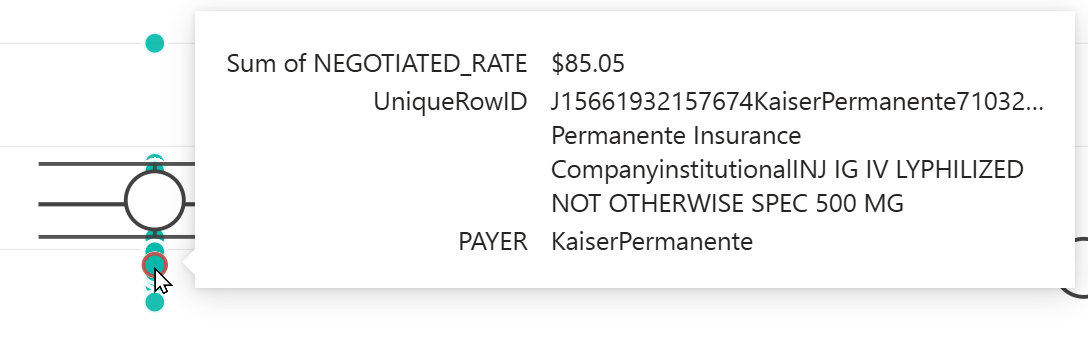 |
|
Payer Metric Details - hover over the vertical line or over the upper or lower whisker to open a panel of details
|
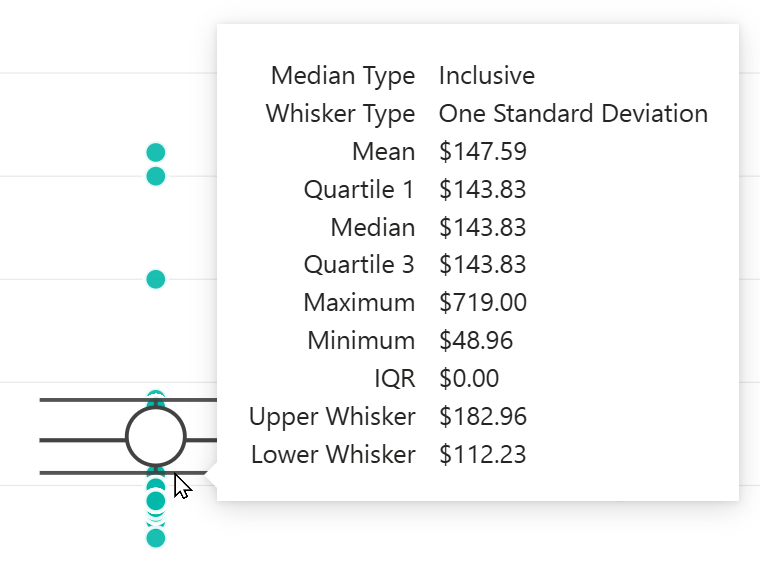 |
Box Plot
The following summary will not show every possible box plot visual that you will see on the Average Rates by Payer page. The following provides basic definitions, not how each metric is calculated.
| Maximum score - The highest value in the dataset | 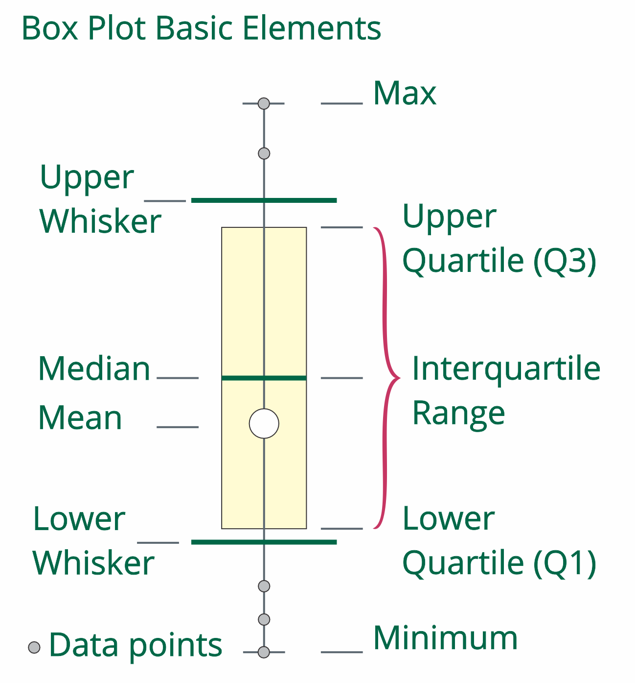 |
| Upper Whisker - range scores above the middle 50% | |
| Upper Quartile (Q3) - the data point under which 75% of the scores will be found | |
| Median (average) - The mid-point between the maximum and minimum data points | |
| InterQuartile Range (IQR) - contains the middle 50% of the scores from all data points | |
| Mean (Average) - Total of all payments divided by the number of payments | |
| Lower Quartile (Q1) - the data point under which 25% of the scores will be found | |
|
Lower Whisker - range of scores below the middle 50% |
|
| Minimum score - The lowest data point in the data set |
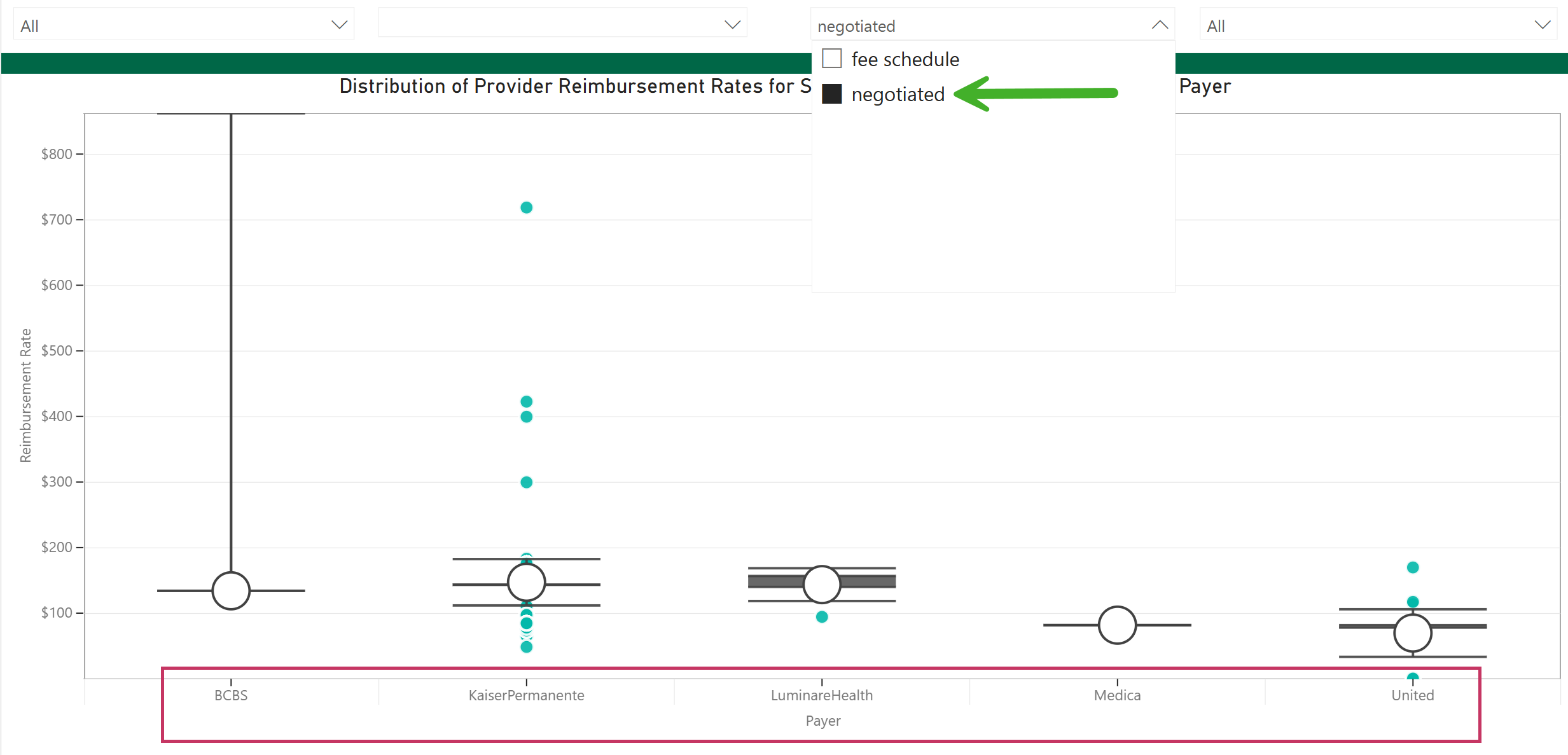
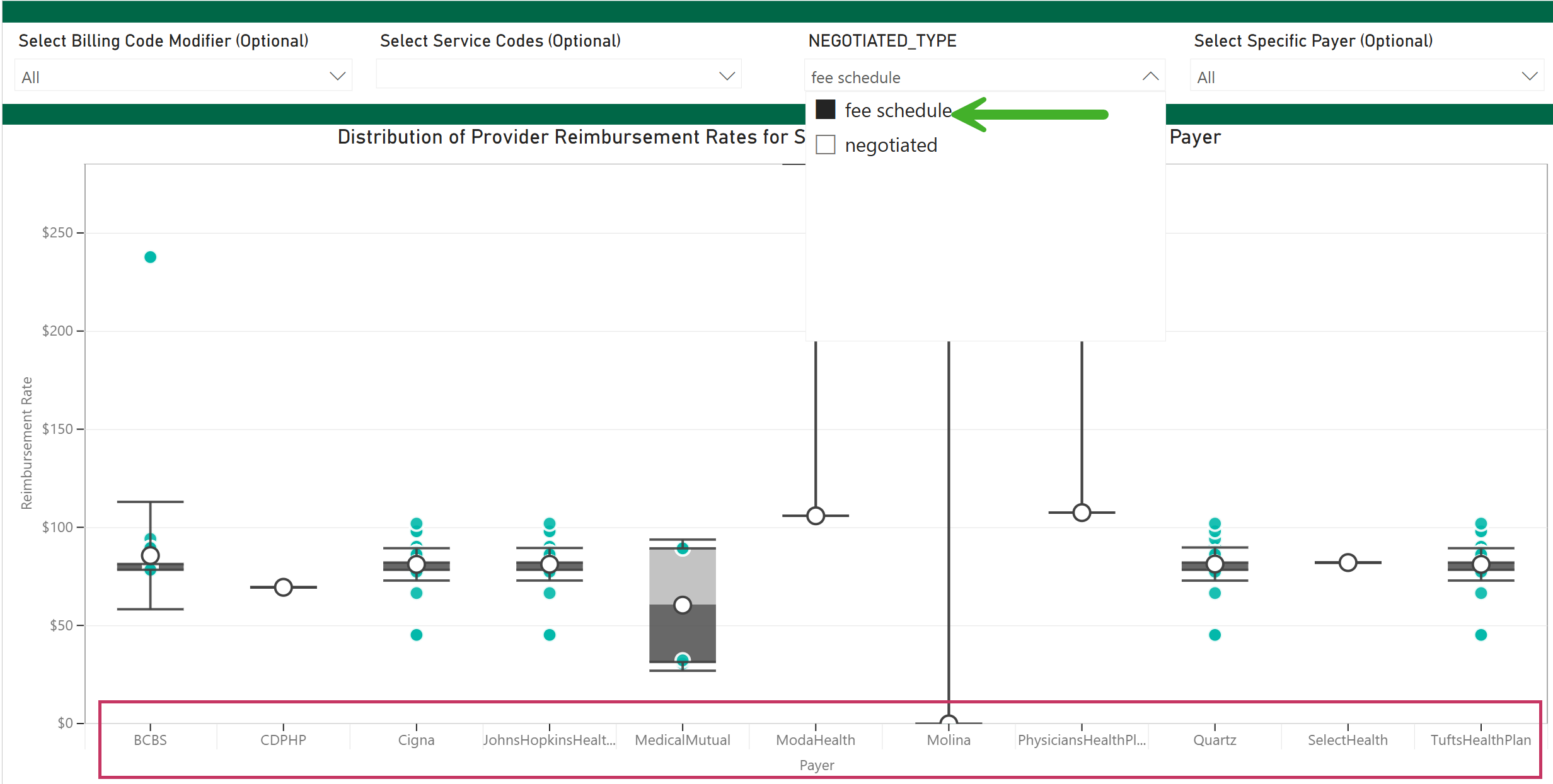
Negotiated vs. Fee Schedule
The difference between the results shown for different options using the "Negotiated Type" filter are significant. We include the following images to call this to your attention.
Negotiated |
Fee Schedule |
 |
 |
HCPCS Price Range by Payer (Chart)
![]() This page will help you to:
This page will help you to:
- Analyze the variation in rates a selected payer offered for a specific service
- Determine the target rate to negotiate with a payer
- Identify the rate a competitor receives from the payer for a specific service
![]() The chart on this page shows metrics for a selected single payer and billing code. Since that is the case, we are evaluating the spread of differing prices reimbursed by the selected payer.
The chart on this page shows metrics for a selected single payer and billing code. Since that is the case, we are evaluating the spread of differing prices reimbursed by the selected payer.
Filters
Here are the filters for the HCPCS Price Range by Payer report
Filter name |
image |
|
Select Billing Code (Required) - You must choose a single option from the list For our example we chose J1566: Immune globulin, powder |
|
|
Select Provider State (Required) - You must choose a single state For our example we chose California (CA) |
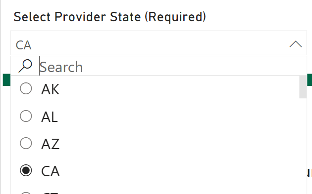 |
|
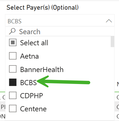
Select Payer (Required) - Since the chart on this page focuses on a single payer, you must choose a single payer from this filter For our example we chose: BCBS |
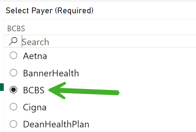 |
|
Select NPI Type: Taxonomy Specialty - Select a specific provider type to filter the chart to that specific provider type For our example, we chose to view Other Provider: 3336H0001X: Pharmacy |
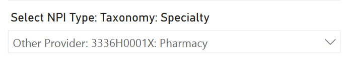 |
|
Select Service Codes - (Optional) - You can select some codes and groups of codes, which are presented as two digits. For our example table, we chose the "Select all" option.
|
|
|
Select Negotiated Type - (Optional) - (This filter is required, even though it is not marked as such)
|
|
|
Select Billing Code Modifier - (Optional) - Choosing a billing code modifier will limit the results in the chart to transactions using the modifier In our example, there were no modifiers to display. |
No image to display |
|
Search for a Specific Agencys' (sic) Reimbursement Rate - If the payer has multiple recipients of reimbursement, you can single out one recipient using this filter.
|
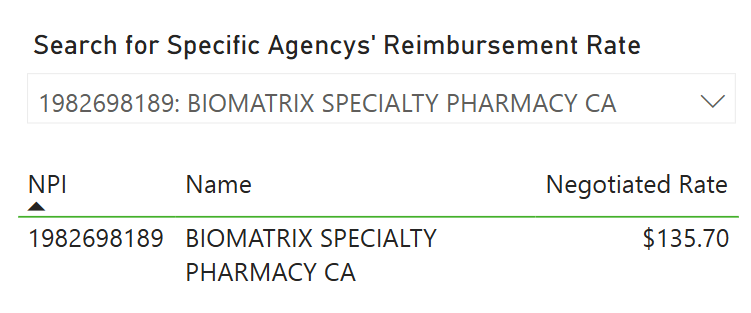 |
Chart Details
Once you have set the filters, the chart will display the results:
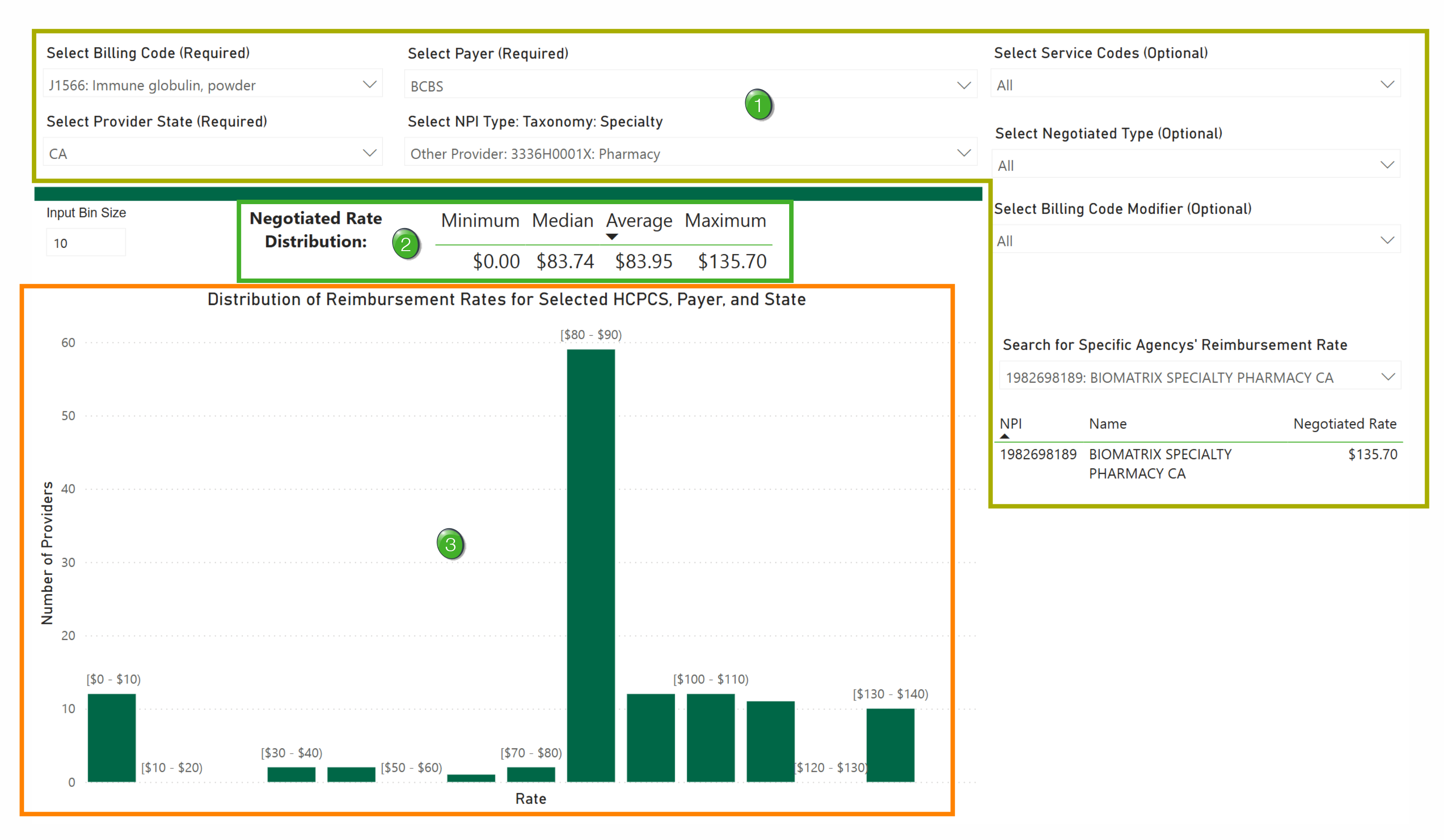
![]() Filters - These are listed above. The results in the chart will reflect the filter settings you selected.
Filters - These are listed above. The results in the chart will reflect the filter settings you selected.
![]() Negotiated Rate Distribution - The basic statistics for the rates shown in above the chart.
Negotiated Rate Distribution - The basic statistics for the rates shown in above the chart.
![]() Since the "Median" is an average, too, the metric under "Average" is the mean average.
Since the "Median" is an average, too, the metric under "Average" is the mean average.
![]() Rates Distribution - The chart shows a bar graph with a spread of rates for the selected payer and billing code.
Rates Distribution - The chart shows a bar graph with a spread of rates for the selected payer and billing code.
![]() Some Details
Some Details
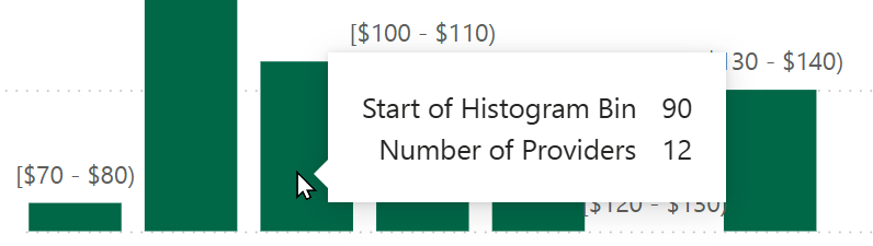
- The range for each bar is listed at the top. For the chart shown above, each bar represents a ten dollar range
- When you hover over a specific bar, a popup will open that shows two additional details
- Start of Histogram Bin - identifies the lower end of the range for the selected bar
- Number of Providers - The count of the providers reimbursed at a price in the range for each bar
Rates by Reporting Entity (Table)
This table features a complete set of metrics for a selected payer and billing code.
![]() The table on this page shows metrics for a single payer. In this case, the content is more comprehensive than the HCPCS Price Range by Payer report.
The table on this page shows metrics for a single payer. In this case, the content is more comprehensive than the HCPCS Price Range by Payer report.
Filters
Here are the filters for the Rates by Reporting Entity report.
|
Select Billing Code (Required) - You must choose a single option from the list For our example we chose J1566: Immune globulin, powder |
|
|
Select Provider State (Required) - You must choose a single state For our example we chose California (CA) |
|
|
Select Payer - (Optional) - Select a payer of interest, OR, you can choose to select all, which will present you with a table that displays every payer in the selected state for which the selected billing code can be applied. That could be a huge amount of entries. See Column Filters, below. For our example we chose: BCBS |
 |
|
Select NPI Type: Taxonomy Specialty - Select a specific provider type to filter the chart to that type For our example, we chose to view all taxonomies. |
|
Column Filters!
Along the right side of the table is a list of filters that match the columns in the table. You can filter the table by different entries for any column.
The following image shows part of the table with all of the filters to show what the filters look like. You can click on the picture to expand it, but an easier-to-view image is provided next.
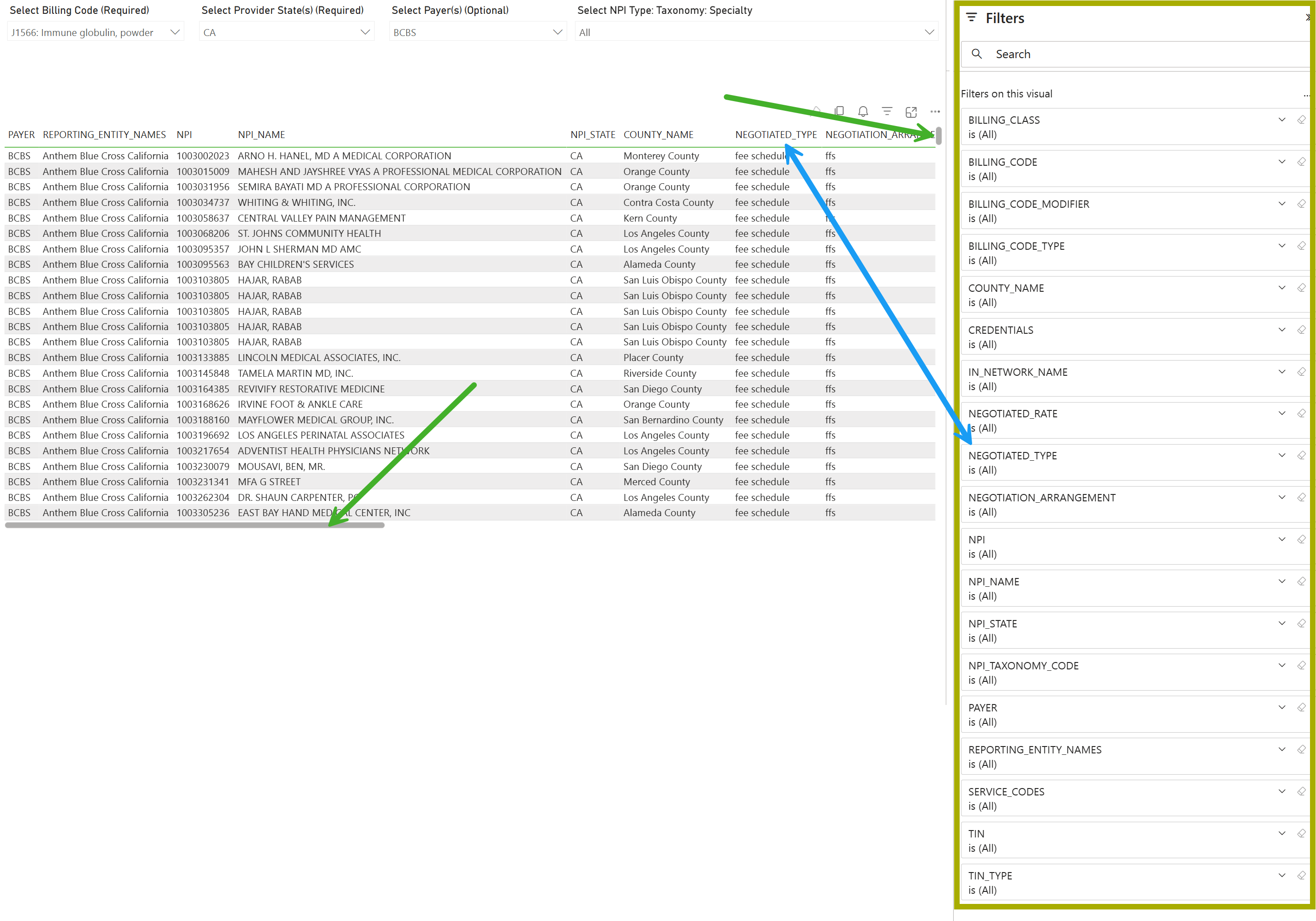
 Important details
- The double ended arrow shows that the column in the table matches the filter in the column filters - all columns match
- The other arrows call attention to the scroll sliders. The image only shows a part of the results in the table, you can scroll down to see more entries (over 50,000) and scroll to the right to show the rest of the columns in the table.
The following image shows the columns filters in a format easier to read.
Usage Example:
- Click on the column filter you want to use
- The filter will open - see image below
- click on an option or options
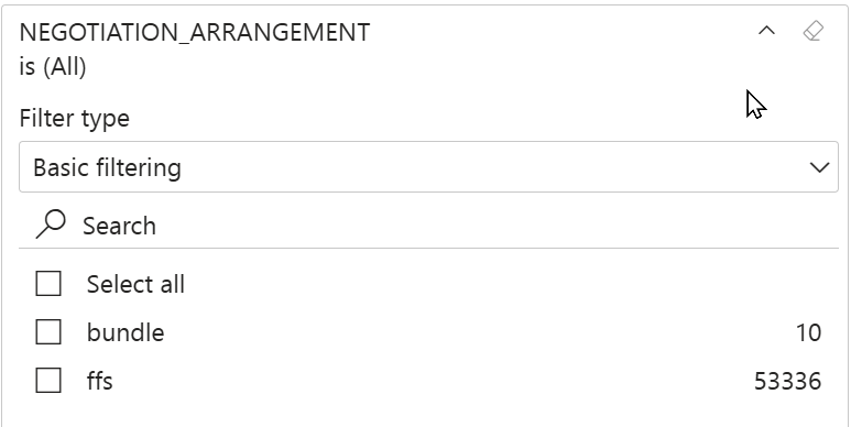
Important details
- There are two different metrics in the Negotiation_Arrangement column, ffs and bundle. (As shown above.)
- The numbers to the right indicate the number of entries (rows) that are available to be shown in the table that include the listed result.
- E.G. - In this case, you could select "bundle" and limit the table to those 10 rows.
![]() You can use as many column filters as you want.
You can use as many column filters as you want.
![]() Oops! Sometimes the column filters disappear. If this happens, try the following:
Oops! Sometimes the column filters disappear. If this happens, try the following:
- Refresh the page (F5) key
- Click on any metric in the table
Table Details
The following image is a screenshot of the entire table scrolled from left to right. The columns are listed below the image.
![]() If you want, you can click on the image to expand it.
If you want, you can click on the image to expand it.
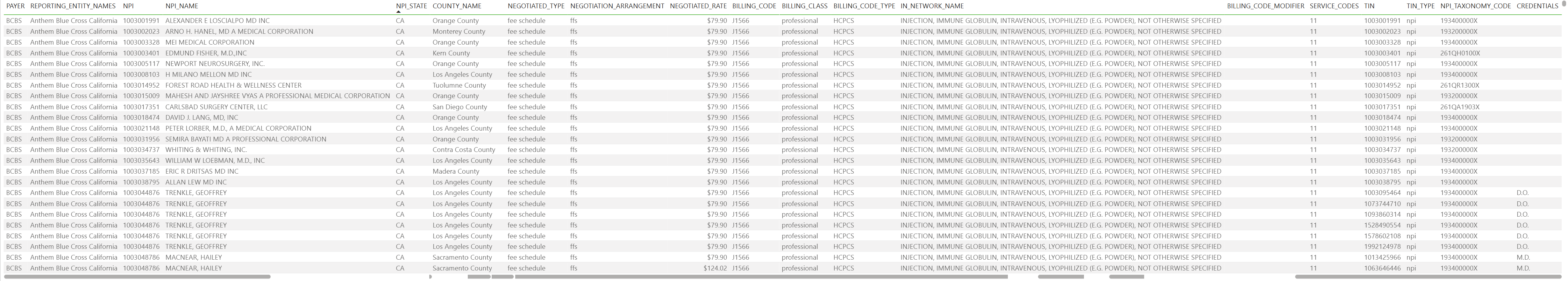
Columns in table |
| Payer |
| Reporting Entity Names |
| NPI |
| NPI Name |
| NPI State |
| County Name |
| Negotiated Type |
| Negotiated Rate |
| Billing Code |
| Billing Class |
| Billing Code Type |
| In Network Name |
| Billing Code Modifier |
| Service Codes |
| TIN |
| TIN Type |
| NPI Taxonomy Code |
| Credentials |
Exporting data
In PowerBI, it is easy to filter the table to show the metrics you want to see. However, in light of the potentially huge results and the amount of scrolling required, it is easier to view the data as a spreadsheet. Exporting the contents of the table is easy:
- Click on the three dots at the top right of the table
- Select the "Export data" option
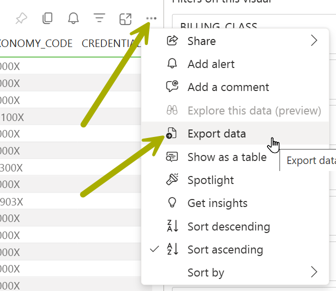
![]() The export limit is 150,000 rows.
The export limit is 150,000 rows.
Organization & Payer – Rate Comparison (Table)
The table in this report is a simplified view for comparing rates across providers and payers for a specific HCPCS code.
![]() The chart on this page shows metrics for a single payer. In this case, the content is more comprehensive than the HCPCS Price Range by Payer report.
The chart on this page shows metrics for a single payer. In this case, the content is more comprehensive than the HCPCS Price Range by Payer report.
![]() Plan Ahead - This table shows the rate connection between every payer and provider in the selected state for a selected HCPCS code. This can potentially fill the table with tens of thousands of providers for scores of payers. If you can use the filters to limit the table to groups of payers and providers, or maybe to a specific taxonomy, the number of entries in the table will be easier to evaluate.
Plan Ahead - This table shows the rate connection between every payer and provider in the selected state for a selected HCPCS code. This can potentially fill the table with tens of thousands of providers for scores of payers. If you can use the filters to limit the table to groups of payers and providers, or maybe to a specific taxonomy, the number of entries in the table will be easier to evaluate.
Filters
|
Select HCPCS Code (Required) - You must choose a single option from the list For our example we chose J1566: Immune globulin, powder
|
|
|
Select Provider State (Required) - You must choose a single state For our example we chose California (CA) |
|
|
Select NPI Type: Taxonomy Specialty - Select a specific provider type to filter the chart to that specific provider type For our example, we chose to see data for all providers |
|
|
Select Billing Code Modifier - (Optional) - Choosing a billing code modifier will limit the results in the chart to transactions using the modifier In our example, there were no modifiers to display. |
No image to display |
|
Select Service Codes - (Optional) - You can select some codes and groups of codes, which are presented as two digits. For our example table, we chose the "Select all" option.
|
|
|
Negotiated Type - (This filter is required, even though it is not marked as such) For our example we chose the "negotiated" type.
|
|
|
Select Specific Payer - (Optional) - Select one or more payers. Only the payers you select will show up in the table.
|
 |
The filters on the right are described in the table details below.
Table Details
Use the following image to familiarize yourself with the Organization & Payer - Rate Comparison report.
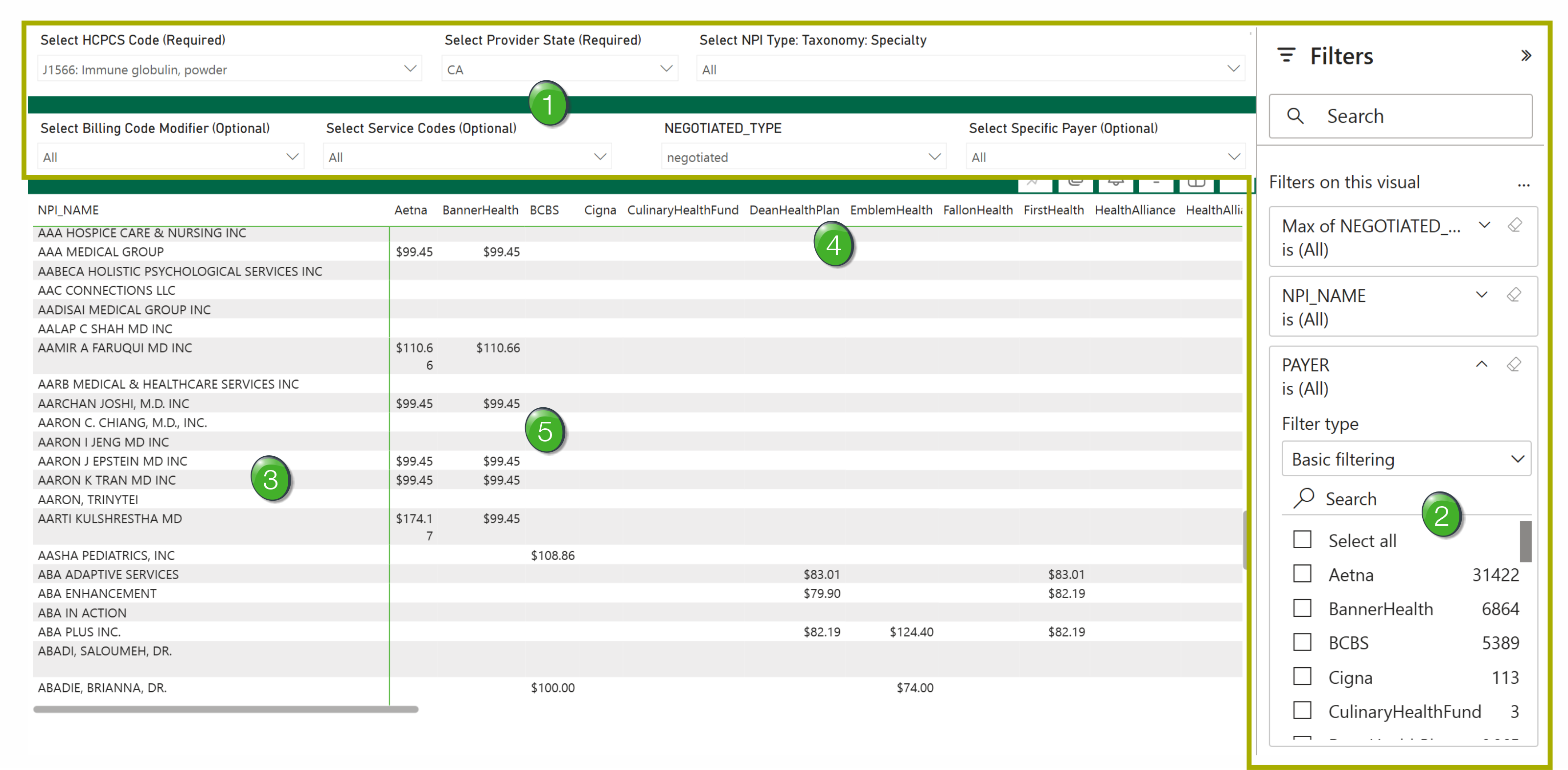
![]() Filters - These are described above. Set the filters to display the payers, providers, and HCPCS codes you want to evaluate and compare.
Filters - These are described above. Set the filters to display the payers, providers, and HCPCS codes you want to evaluate and compare.
![]() Column Filters - There are three column filters to the right of the table.
Column Filters - There are three column filters to the right of the table.
|
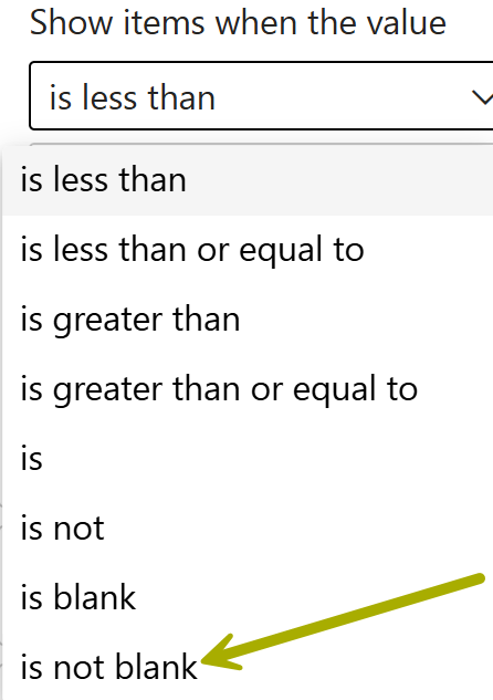
Max of Negotiated_Rates - this filter allows you to select an upper or lower limit of prices, or a range of prices, to be displayed in the table. The image to the right shows you the spread of options for this filter. If you choose "is not blank," the table will only show entries that have prices. |
 |
|
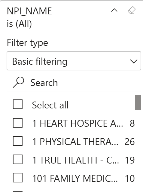
NPI_NAME - using this filter will limit the entries (rows) in the table to a provider or providers you choose.
|
 |
| Payer - Use this filter to limit the results shown in the table to a single payer or multiple payers. | 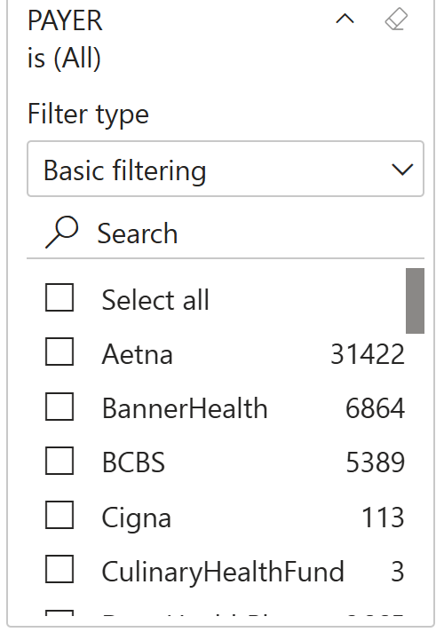 |
![]() Oops! Sometimes the column filters on the right disappear. If this happens, try the following:
Oops! Sometimes the column filters on the right disappear. If this happens, try the following:
- Refresh the page (F5) key
- Click on any metric in the table
![]() NPI_Name (Providers) - The first column on the left identifies the provider for each row.
NPI_Name (Providers) - The first column on the left identifies the provider for each row.
![]() Remember - If you don't limit the providers with the Select NPI Type: Taxonomy: Specialty filter, the table will show every provider in the selected state that has at least one price from a payer for the selected HCPCS code. The results could end up being tens of thousands of entries.
Remember - If you don't limit the providers with the Select NPI Type: Taxonomy: Specialty filter, the table will show every provider in the selected state that has at least one price from a payer for the selected HCPCS code. The results could end up being tens of thousands of entries.
![]() Payers - the names of the payers are the headers for the columns in the table.
Payers - the names of the payers are the headers for the columns in the table.
![]() Remember - There aren't as many payers as providers, but you still may need to scroll to the right to find a payer you want to see. Use the Select Specific Payer filter to choose a smaller selection of payers for inclusion in the table
Remember - There aren't as many payers as providers, but you still may need to scroll to the right to find a payer you want to see. Use the Select Specific Payer filter to choose a smaller selection of payers for inclusion in the table
![]() Rates - The metrics in the table are all rates from the payer in the column to the provider in a row.
Rates - The metrics in the table are all rates from the payer in the column to the provider in a row.
![]() Use this table to evaluate specific payers, identify rates paid to a specific provider, or to compare payers or to compare providers.
Use this table to evaluate specific payers, identify rates paid to a specific provider, or to compare payers or to compare providers.
Exporting data
In PowerBI, it is easy to filter the table to show the metrics you want to see. However, in light of the potentially huge results and the amount of scrolling required, it is easier to view the data as a spreadsheet. Exporting the contents of the table is easy:
- Click on the three dots at the top right of the table
- Select the "Export data" option
![]() The export limit is 150,000 rows.
The export limit is 150,000 rows.
Organization Profile (Table)
This table will allow you to gain insight into how a payer's rates for a specific provider differ by reporting entity.
![]() The table on this page shows metrics for a single provider. The table will show you rates from all payers for a number of selected HCPCS codes.
The table on this page shows metrics for a single provider. The table will show you rates from all payers for a number of selected HCPCS codes.
![]() You will need to bring a specific organization of interest to the use of this report.
You will need to bring a specific organization of interest to the use of this report.
Filters
|
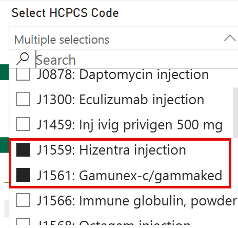
Select HCPCS Code - Choose a single HCPCS code or multiple codes to show rates received by the selected organization (provider). For our example we chose J1559: Hizentra injection and J1561: Gamunex-c/gammeked
|
 |
|
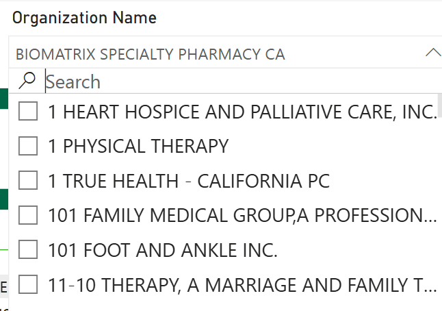
Organization Name - This is required, even though it is not identified that way. You must choose a single organization (provider) since the table is all about showing metrics for a single org.
|
 |
|
Select Provider State - You must choose a single state For our example we chose California (CA) |
|
|
Select NPI Type: Taxonomy: Specialty - This filter allows you to choose a specific taxonomy or specialty for the table.
|
No image for this filter |
|
Select Billing Code Modifier - Choosing a billing code modifier will limit the results in the chart to transactions using the modifier In our example, there were no modifiers to display. |
No image to display |
|
Select Service Codes - You can select some codes and groups of codes, which are presented as two digits. For our example table, we chose the "Select all" option.
|
|
|
Negotiated Type - (This filter is required, even though it is not marked as such) For our example we chose the "negotiated" type.
|
|
|
Select Specific Payer - (Optional) - You may choose a single payer or multiple payers.
|
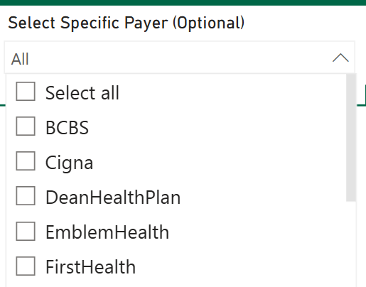 |
Table Details
Use the following image to familiarize yourself with the Organization Profile report.
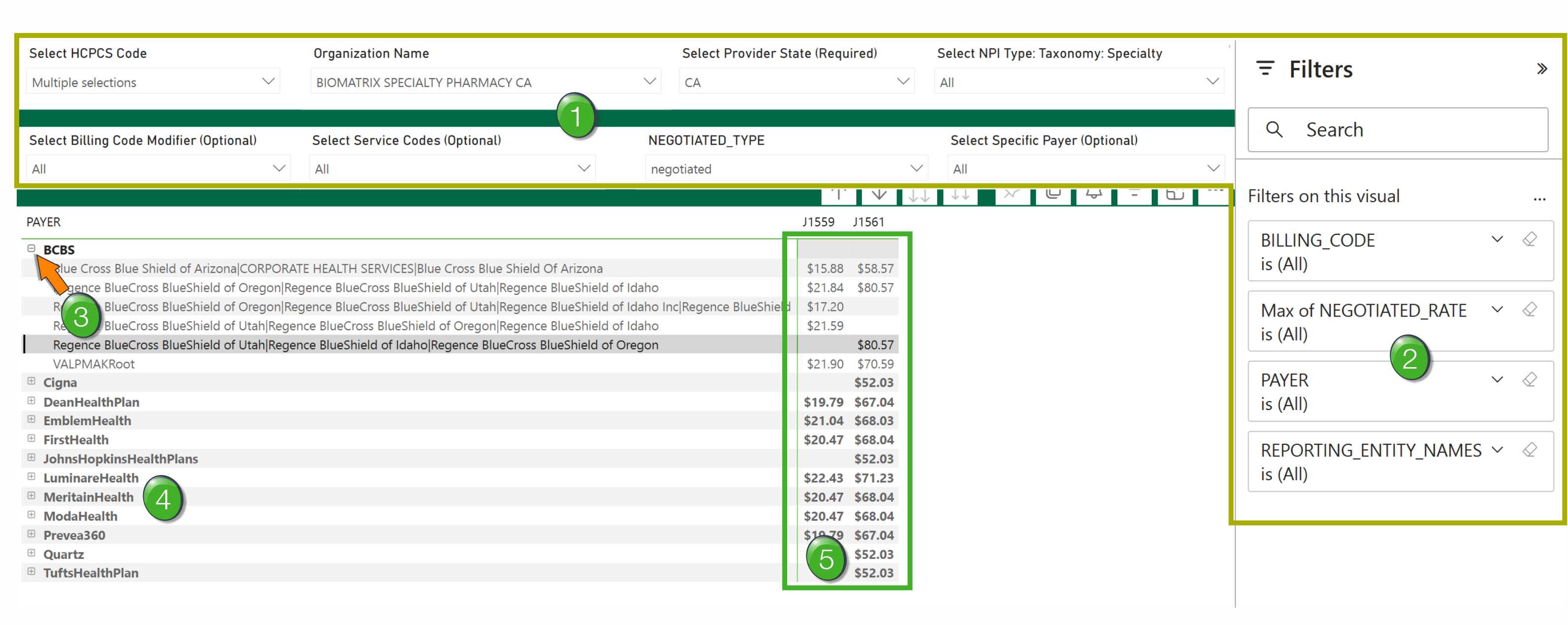
![]() Filters - These are described above. Set the filters to display the payers, providers, and HCPCS codes you want to evaluate and compare
Filters - These are described above. Set the filters to display the payers, providers, and HCPCS codes you want to evaluate and compare
![]() Column Filters - There are four column filters to the right of the table.
Column Filters - There are four column filters to the right of the table.
|
Billing Code - this filter allows you to select to display one, many, or all of the codes you chose when you set up the HCPCS Code filter.
|
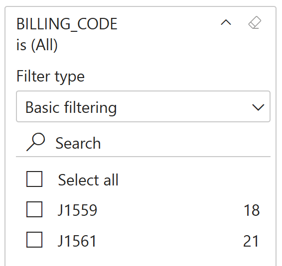 |
|
Max of Negotiated_Rates - this filter allows you to select an upper or lower limit of prices, or a range of prices, to be displayed in the table. The image to the right shows you the spread of options for this filter. If you choose "is not blank," the table will only show entries that have prices. |
|
|
Payer - limit which payers are displayed in the table - choose one, many, or all. This is the same as the Select Specific Payer filter.
|
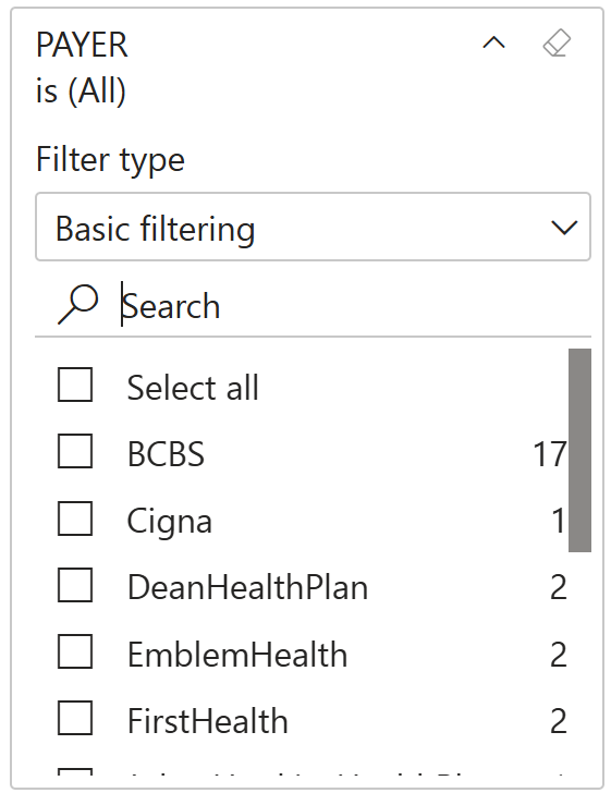 |
| Reporting Entity Names - The broader org pays under specific reporting entity names. Select one, many or all reporting names to appear in the report. | 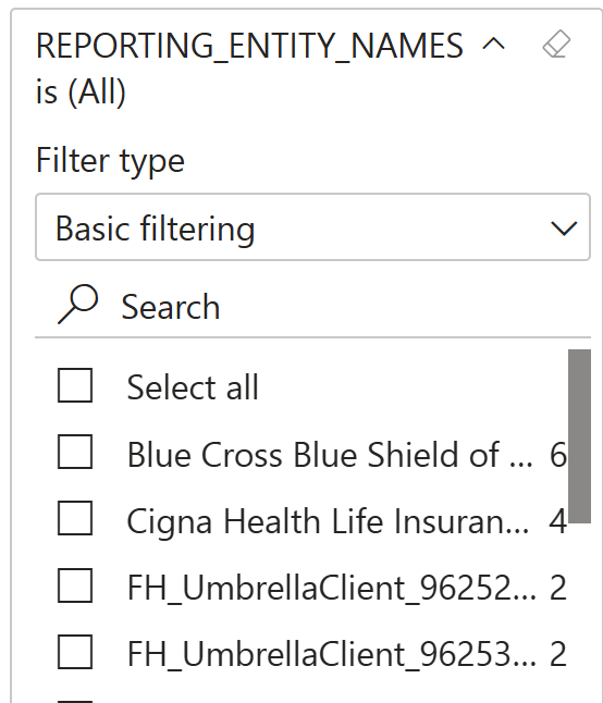 |
![]() Reveal/Hide - Click on the plus "+" to the left of the org name to expand the details. Click the minus "-" to hide details.
Reveal/Hide - Click on the plus "+" to the left of the org name to expand the details. Click the minus "-" to hide details.
![]() Payers - All payers that match the chosen filters will appear in the table in the left column.
Payers - All payers that match the chosen filters will appear in the table in the left column.
![]() Rates per HCPCS code - columns for all selected HCPCS codes will display any rates that apply to the payer in the same row. Bold rates are the highest rates for all reporting entities under the un-revealed org.
Rates per HCPCS code - columns for all selected HCPCS codes will display any rates that apply to the payer in the same row. Bold rates are the highest rates for all reporting entities under the un-revealed org.
